- 05/10/2012
- Posted by: Mike O'Malley
- Category: Uncategorized
No Comments
When someone’s marketing captures my attention, I often ask myself, ‘Why?”
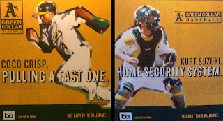
 I snapped these Oakland A’s transit ads on the BART because I was instantly engaged. I loved the combination of humor and competiveness, as well as the way they made me feel about the team.
While the A’s are 20+ years removed from their last World Series rings, these posters gave me the impression that this is a team that plays hard and plays to win. This is no bunch of lollygaggers (intentional “Bull Durham” reference).
Green Collar Baseball plays off the obvious blue collar allusion and reinforced the idea of a team that shows up and works hard every day.
I’m sure it was no accident that there was both an offensive and defensive poster. Together they gave me the feeling that the A’s are both dangerous on the bases and stalwart defenders.
The shots and captions made it personal. I want to root for these two guys. I’ll be checking in to see how many bases Coco Crisp steals and see what Kurt Suzuki’s stats are.
But it was the copy’s humor that initially drew me in (the fun is further developed in a series of online videos about the team and the players).
Hub Strategy is the San Francisco agency that produced these. Their brand building strategy is three-fold: develop a specific and competitive position, produce ‘embraceable’ creative, and have consistency across platforms.
The result according to Hub Strategy?
“Messaging that is strategically sound, difficult to ignore and consistent everywhere the consumer is likely to come in contact with it. That’s our secret. Now, whatever you do, don’t tell anyone.”
Oops. Guess I thought I was “pulling a fast one” too.
If you found this interesting, here’s an older post on effective morning show billboards
