- 08/23/2017
- Posted by: Mike O'Malley
- Category: country radio programming, management, radio programming

Graphs and charts can help you make a point, particularly if you want to show the relationship between things. They can help simplify complex data and ideas, reduce noise, add interest, and can help the receiver focus on your message.
There plenty of software tools that produce great visuals: Excel, Numbers, Venngage, Google Sheets, Plot.ly and more. But a hand drawn “doodle chart” adds personality to the data while still allowing you to emphasize your key points – and you don’t have to power up your notebook to create one (of course there is software for that as well).
Here are three radio-themed doodle charts that you can adapt for your next staff meeting.
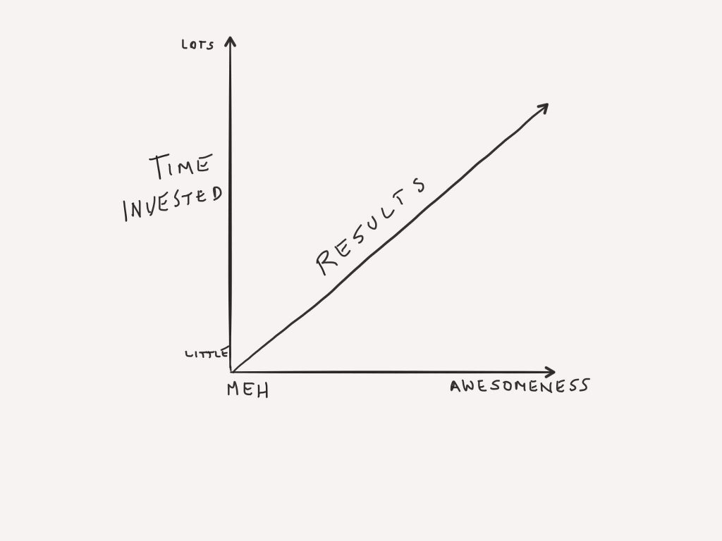
#1 The Relationship between Preparation and Outcome
Whether you’re crafting your next show, producing a pitch to a prospective client, or readying yourself for your next career advancement, putting in prep time generally yields better results as this doodle chart depicts. We could also get more detailed by adding specific actions from least to most important on the Y axis.

Similarly invest time in what’s important to you: career, reationships, expertise, paying it forward – these and more will benefit in relationship to your time commitment.
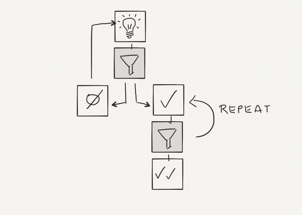
#2 Passing an idea through a filter:
Subjecting an idea to one or more filters can help you get the most out it. Some of my favorite filters are:
Filter #1: Will our target care?
Filter #2A: Can we widen the funnel?
Filter #2B: Does this polish our brand?
Filter #2C: Can we make anything bigger/better/evoke more emotion?
Here’s a doodle chart that illustrates the process:

Revisit one of your recent ideas. What happens when you subject it to some appropriate filters?
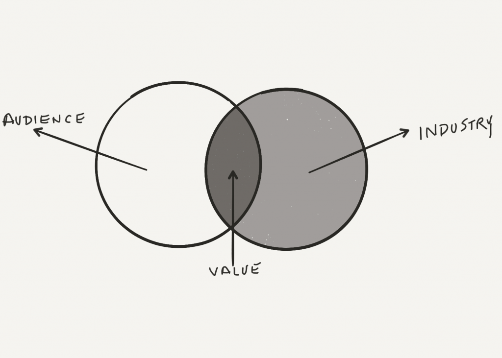
#3 Creating Value
This doodle chart illustrates what happens at the intersection of the latest information about our target audience and what is going on in our industry: new ideas that will increase satisfaction.

Have a helpful doodle chart or want one to visually express a concept? Feel free to join the conversation here.
More on filters? Check our these posts:
PD “Muscle Memory” – A 5-Point Filter for Evaluating Daily ‘Opportunities’
Copyright: <a href=’https://www.123rf.com/profile_ximagination’>ximagination / 123RF Stock Photo</a>
